Beginner's mindset
In short: every screen of the experience has to make sense like you’re seeing it for the first time.
This is one of my favorite principles I learned about early on, and a useful mindset that you need to incorporate when looking at every screen you design and build. Every screen has to instantly translate what was happening before, and what is about to happen. Especially intermediary ones.
Why? Because we live in a world full of distractions. People’s attention spans trend down due to the ease of media access and information overload. But it’s also just because people can get distracted: your mother called her asking how to restore her iCloud password, your friend sends you a video of people doing stupid things (yep, that’s my life), or your cat is just so damn cute (I don’t have a cat, sigh).
So that when the user returns to the flow, they can quickly pick it up. They could be doing anything: from renaming a file to filling out a checkout form.
It’s like Artem Gorbunov said, ”Look at the screens as if your memory was wiped—like in ‘Men in Black’”.
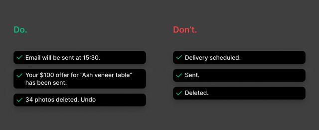
The majority of the time this is all solvable with plain copy. Avoid UI messages like “Completed”, ”Success”, or “Continue to the next step”. What was completed? What is considered success? Tell users exactly what they were doing and where the journey leads them.

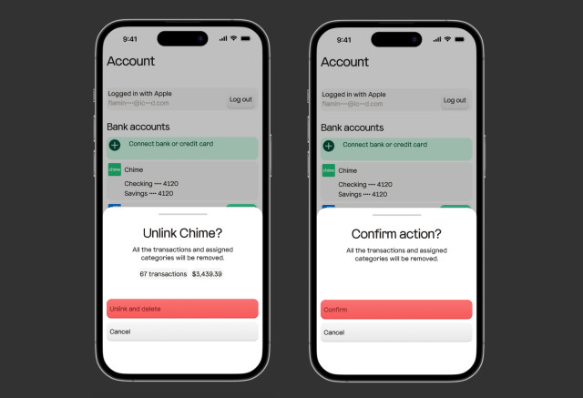
In 3vit, unlinking a bank is a destructive action. Confirming the operation points out specifically what bank is being unlinked, how many transactions, and most importantly, their value is about to be lost.

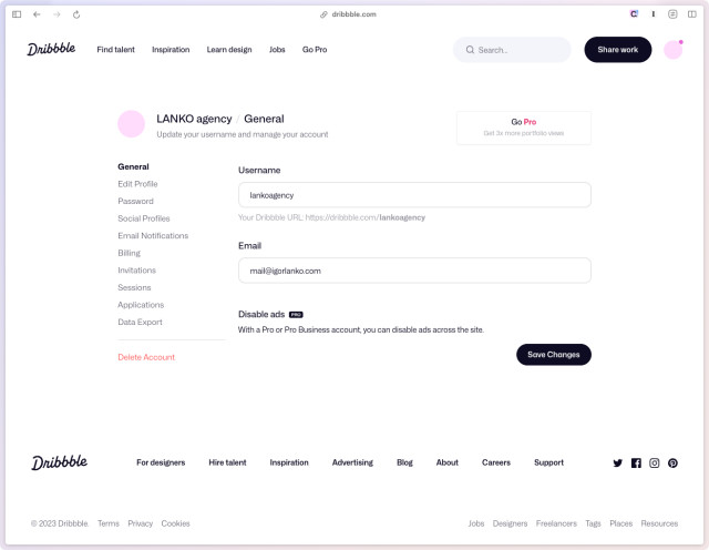
But details can be much more subtle, and still confusing. On Dribbble, deleting a team is done through the team settings. User can click on “Delete Account” option in the bottom left of the nav.

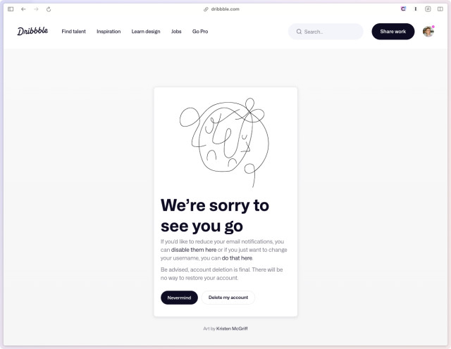
However, they’re reusing the same screen for deletion of both teams and the account. See what’s happening here? If I got distracted, and then returned to this screen, I wouldn’t be sure whether I’m deleting my team, or my personal account (notice my avatar in the top right).
Additionally, the main text doesn’t provide context of what I’m deleting.

So not only I had to play a guessing game here, but also made a bet. My personal account was not deleted, but this design is as good as for deleting it indeed and not knowing the difference.
That said, never assume people will complete your flow at one go. Expect distractions. And if you do, provide safe, and most importantly, informative ways to resume.