
Mythical Games, player account experience
Working as a small team responsible for multiple products, we managed to cover huge scopes quickly by using an open-source design system.
Design lead
2021—2023
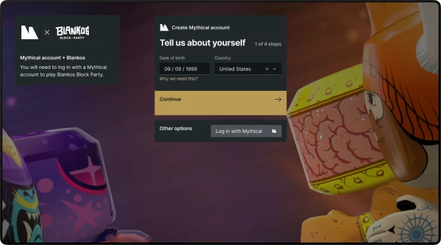
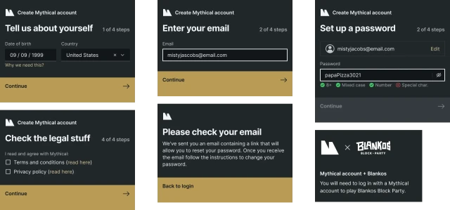
Desktop authorization
While interacting with different experiences like desktop & mobile games, web marketplace, store, and account sites, players expect to go through the familiar user experience regardless of the platform.
We picked Carbon Design System for its versatilitsy as a core of all productive UI*.
“Productive UI is an environment in which users are focused on getting a specific job done, as opposed to Expressive, in which they're exploring and learning.”
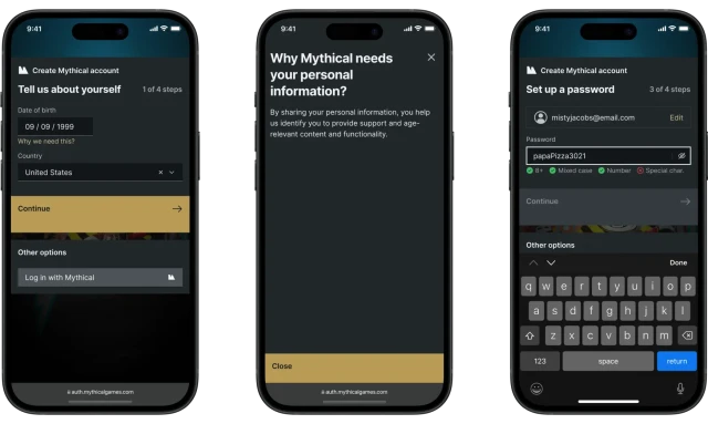
Sign up on mobile
While designing the mobile layout, one of the main challenges was to make it flexible enough to work with landscape mode. Mobile games would use web auth via SFSafariViewController. And some games run in landscape mode.

Account
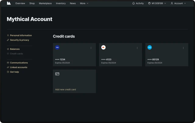
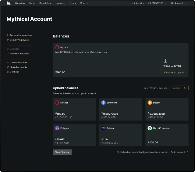
This is the place where player manages their profile info, payments, linked game and social accounts, etc.
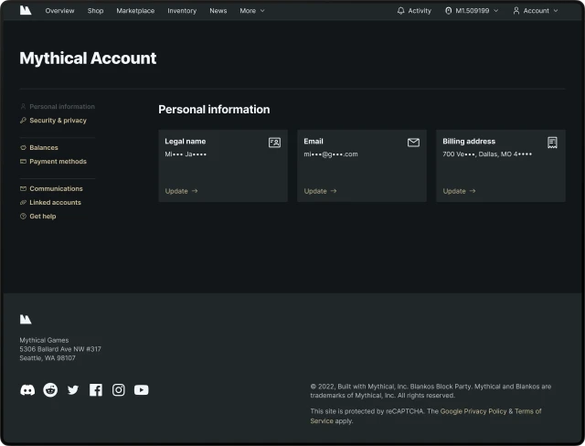
For sake of speed and utility, I used a simple 3-level navigation pattern so the evolving account system (depending on many other components outside of the web part) could quickly adapt to the changes.
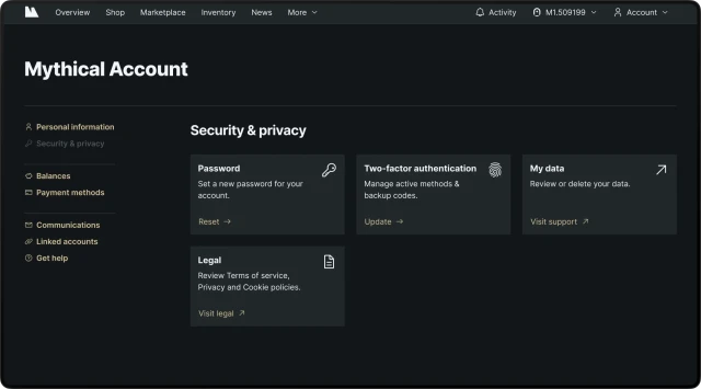
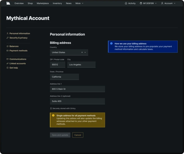
While generic, we thought it’s important to keep player informed about how their data is managed.
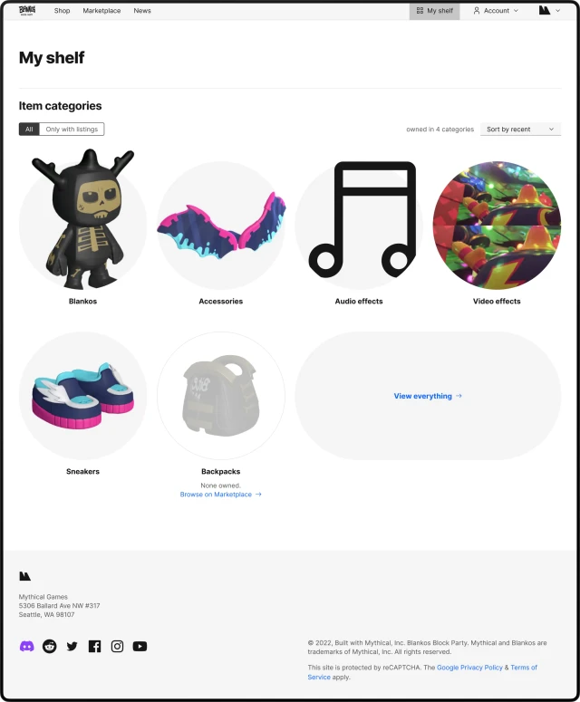
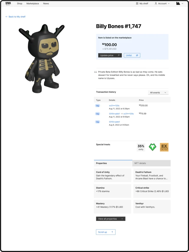
Player inventory
A cool prototype of the in-game items inventory viewable from the web that we had.
Checkout
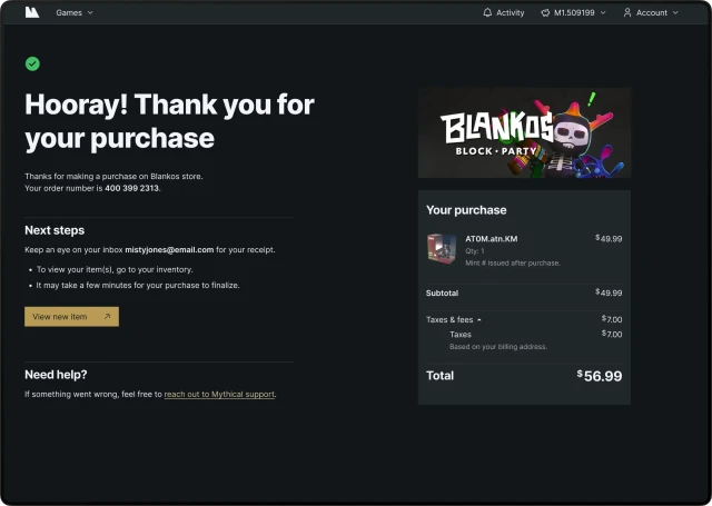
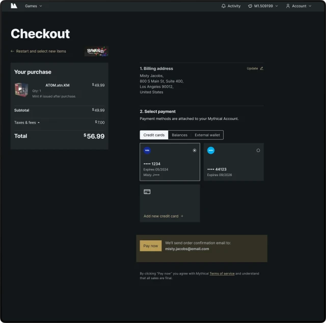
As an extremely complex part of the system that involves transactions inside games, marketplaces, and primary stores, as an Identity team we’ve built a robust checkout templates and prepared guides on how each game within the Mythical ecosystem could adjust it to their needs.
While it may seem trivial, the complexity expands when player is interested in paying with crypto currencies. Think sales & fees calculation, item delivery times, inventory management, etc.
 Elle Opitz
  Igor Lanko
  Jason Li
  Matthew Barnett