Output Portal, granular FX plugin
During my time at Output, I worked on Portal with Neil Hallimen and Daniel Lepik to bring product concept they designed into a digestable UI ready for programming.
UX design: Advanced tab, Preset browsing, activation flow, and utility UIs, development handoff.
Turn an amazing visual concept into programmable software state.
Prototype that sped up the dev process; online & offline activation flow; features cut out due feasibility; critical error handling cases designed; product launched, sales started.
A few months in 2019.
What is a granular FX plugin
Output has a proper explanation, but the TLDR is it takes your sound signal and cuts it into smaller grainy pieces, creating space between them. That obviously changes how you hear the sound.
Here’s a good demo:
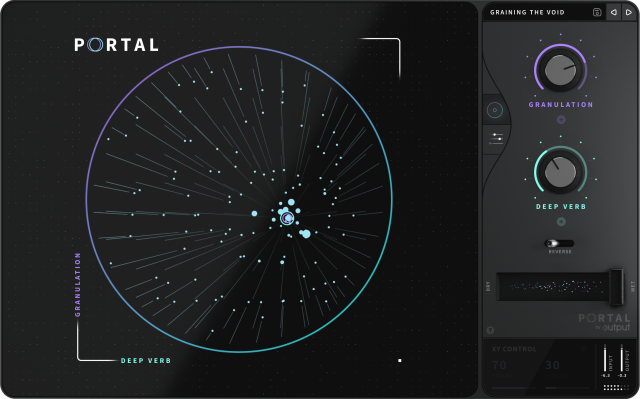
Front & presets screen
The simplest way to control the selected effect by dragging control on the “XY ring“

Advanced mode
Daniel designed the entire plugin in Cinema4D. For better team accessibility and state management, I brought this all into Figma.
As this is the most visually complex page of the plugin, I went through a dozen oiterationstrying to find the balance between overcrowding the UI and fitting all the controls in. Lots of layout design.
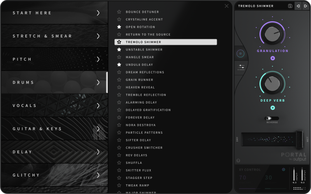
Presets browser
While a producer can fine-tune any parameter of the effect, they can also start with a set of presets designed for the main instrument categories.
This is a relatively standard thing in the music production software world, but I still had to find a way to make a visually appealing list, while at the same allow the producer to quickly switch between them without opening the full thing.

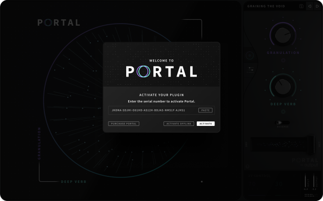
Nailing the details: activation, error handling
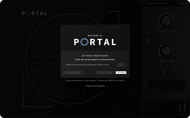
It’s a good “enter your license key” kind of software activation, but because it checks the code against the online server, we had to go through possible error scenarios and how they are presented. So that a person could understand if something is wrong and what can they do about it.

But if something goes wrong:

Creating components
To prepare the concept for the programming stage we used Figma to write component documentation for all the styles, possible states and variants. Essentially synthesize the atomic design of the plugin. Mind you, that was before Figma’s component properties feature.

Disclaimer
Some pieces of work presented may not display the current state of the product. All rights to the media content presented belong to Output, Inc.
 Daniel Lepik
  Garrett Burnett
  Igor Lanko
  Neil Hallimen
  Jake Penn